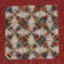
 Here is the center of my miniature! Wooo Hooo! I only lost "some" points, but for that small not bad. Now my dilemma. It gets a small 1-1/2" border around it. I started out thinking maybe a brown or blue or the really pretty goldish/brown - but those seemed pretty flat when I tried them.....
 So then for fun I plopped down the fun cheddar fabric I have.... nope.....
 Then thought maybe the really pretty dark red I had in it - yes, I think much better - what do you think?


43 comments from wonderful readers:
I like the red the best - it sings to me the loudest. But then I like red more than green! It's such a neat looking quilt Dawn!
I like green... but the print is too small for my liking. The red print size is the best match... so say, you don't have anything like that in green, do ya? ;)
Wow oh wow! I love your quilt! .... and amazing considering the scale. Even tho green is my favorite color, I think the red works the best.
I love the quilt. The blocks are gorgeous. I like the red best for the border.
The red is the colour that appeals the most to me. But it is your choice.
I like the red one the best. Nice quilt!
Dawn - definitely the poison green - I picked it from the top picture even before I started scrolling down through your post. Apart from anything else it's matching block is in the centre far enough away from the border whereas the red will sit next to its block :o)
The red one.
Quilt looks great
It looks like red and green are the popular choices..funny no one likes the yellow/orange :) Personally I like the red more...the green seems a bit flat.
Lovely workmanship...congrats.
For me, the red does it! The blocks look great by the way.
The red made me say WOW!
BTW, it's darling!!!
Oh my gosh Dawn it is just awesome...I am drooling...can't wait to get upstairs tomorrow and make more of those tiny blocks. I LOVE the red border.
You have me hooked on these little blocks. I didn't ever think I could do anything that small. Thank you!
res or green or what you like best. The little blocks are really neat and they look great. I really like the background fabric you chose to use.
I like the green color but the pattern on the red is a better size so I'd go for the red.
Red is one of my favorite colours. My choice goes obviously for red. I think it looks great here.
Another vote for red.
I think red too. The colors have something to dark enough to contrast to. VERY nice...
I'm usually more of a green person than a red, but I liked the contrast with the red fabric sooo much better. So now you know what I would choose, but in the end it is your decision :o)
I'm voting for the red too.
I really think the red sets off the blocks the best.
Okay, Dawn, I'm the odd man out here. LOL It's perfect with the red, but you know what---I REALLY like it with the Cheddar too. :D I need to find some of that Cheddar for my stash. :) It's a gorgeous little quilt, BTW!!!
Dawn, it's just wonderful. For the border I say - pick red, pick red *s*
Red for me, Dawn! I do love the green color...but on my monitor, the print messes with my eyes. Maybe it's not that way in person though.
What a darling little quilt! You amaze me!
Hugs to you...have a great weekend!
Wow - this is the longest comment list I've ever seen! I like the cheddar, but not so much of it. The read is cool, but the print is too large and there is too much of it. The green is perfect, but not so much of it. The FIRST one is definitely NO.
They are lovely.
Red my friend, definitely the red. You know how I love green, but that red print makes your mini just stand up and say "look at me".
I love it....
Before I saw any of the options, i thought green ... but, like almost everyone else, I think the dark red works best. It seems to bring out all the colors in your wonderful miniature blocks.
The red makes it look like an antique (to me) which is a great look - but since my favorite color is green, I would probably go with the green. However, the green gives it a more modern look and if you are going for a vintage look the red seems much better.
Ooooh, I love the dark red--really brings it out!
I like the red too - have you tried a red more like the brighter one in the lower left corner? Red always seems to make things POP!
dark red or gold :) xoxo melzie
This is an amazing quilt - and you have done a wonderful job. I like both the red and the green, but I like the green one better. It may just be the lighting, but it looks like it lightens up the quilt and pulls out the colors of your blocks better.
Well I like the red first, then the green. The blocks are marvellous - I have a small quilt book out from the library, so hopefully I'll be able to try one soon.
I like the poison green the best and then the dark red. I can't believe how tiny those blocks are! Great job!
I like the cheddar. Maybe what you should do is a tiny border of the cheddar for a little sparkle, then that brownish/red one in the picture below the cheddar.
I prefer the orange or should I say chedder. I am an orange person though. What about a 1/2 inch inner border with a 1 inch outer border? Just a thought.
my 1st thought before seeing the previews was to use green - for that solo green block... btu then after seeing the photos I loved that cheddar color - and like the stripe print but not sure if "that" stripe print is the right choice..? Perfect color but print looks to modern for the fabrics in the center of the quilt...
...now to go read what everyone else voted for ;c) ~Bonnie
I really like the green - it makes it pop. The red just blends.
I'm thinking it needs two different borders, as the pieces in the blocks are so tiny that one fat border (even at only 1") will overwhelm the blocks. But it seems like most people that I prefer the red above all the other choices.
You don't have anything suitable in electric blue or royal purple??
Love the cheddar color, but not that particular fabric (don't like the stripe). A richer poison green maybe too. Or the red one you've got... they're all going to look good.
RED!
I personally love the orange (cheddar?) for excitement, but the green is very soothing. What a different look with each of your border choices! Thanks for sharing!
I love to see a blue and a purple;-)
for now I vote for the red !
I vote red of those choices!!
Post a Comment